Elements
Space:
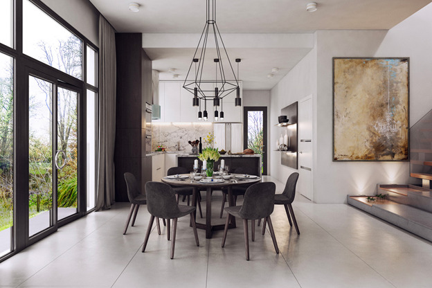
- Open concept dining area located next to the main glass door and kitchen.
- Use of glass doors to connect to external view makes the space look bigger.
- Lighted staircase and long steps on the right, separates the dining area from the living area of the house.
- Kitchen and dining space boundary are defined by the wall corners and different ceiling height.
- Negative space around the round dining table provide ample space for guests to move around when entering the door. It is also a spacious, relaxing place to enjoy good with a good view outside the front door.
Line:
- Corner lines on the ceiling separate the kitchen, dining and living area of the house.
- Lines on the floor, stairs and steps also separate the kitchen, dining and living area of the house.
- The distinct lines on the floors tile and steps provide direction.
- The black wire from the spider web chandelier stands out by contrasting the usual vertical and horizontal white lines in the interior space
Shape:
- The black wire structure of the chandelier looks like an inverted black diamond.
- The round table stands out in a space which are dominated by mostly rectilinear shapes.
- The curvature of the grey suede chair complements the round table and communicate a sense of elegance.
- Rounded, polished chrome door handle contrast with the rectilinear doors and glass windows.
Color:
- There basically two colors, with the off-white or white being the dominant color. The black or dark grey is the secondary color.
- Dark grey dining table and chairs contrast with the light colored flooring and walls.
- The black Chandelier matches the dining table and chair.
- The side of the column at the kitchen next to the window frame are also black or dark grey in color.
Texture:
- Overall texture is low gloss surfaces for wall, floor and kitchen cabinet.
- The suede covered seats looks warm, soft and comfortable for long dining session.
Light:
- Natural lights from the door and glass wall, and can be blocked by the curtain if required.
- Matching color chandelier for the dining table, also matches the color of the kitchen lighting.
- Lighting on the staircases guide the eyes to the second floor.
- Lightings on wall shelf adds emphasis on the displays.
Pattern:
- The countertop with full height backsplash are in marble pattern.
- Wall painting leading to the second floor looks like an abstract artwork, which is similar to “rock” theme (like marble).
Principles
Balance:
- The arrangement of the dining table and chairs is based on radial balance.
Rhythm:
- Progression is shown with those white vase on the lighted wall shelf, with height from short, medium and tall.
- Progression is also shown by the stairs with ascending lights leading upwards to second floor.
Emphasis:
- The full height glass door and wall shows that there is emphasis in the exterior view from the door.
- The dining table, chairs and chandelier are the main emphasis of the dining area. The surrounding within the dining area are negative spaces with nothing that may confuse the emphasis.
- The artwork is the emphasis for the staircase leading to the upper floors.
Proportion and Scale:
- The dominant color is plain white on the floor, wall and ceiling.
- The secondary color is black or dark greyish on the glass frame, dining area furniture and part of kitchen furniture and wall displays.
- The space is basically achromatic, which is why the artwork, even though it has the smallest proportion in the entire photo, it stands out as an emphasis for the staircase.
Harmony:
- Shape: Mostly rectilinear in shape, except for the dining area emphasis which are all consistently round.
- Color: Colors are consistently either dormant white or dark grey/black. All lamps are black in color. Dining area furniture are all black. Glass door and wall frame are all black. Interior wall, floor and ceiling are mostly white in color.
- Texture: Consistent low gloss finish throughout except for the darker surfaces which are matte.
- Lines: Mostly rectilinear, except where soft items are curvilinear.
- Materials: Wood, suede leather, tall glass door and windows, powder coated steel.


